Fireworks Complaints Map In NYC
Background
Every summer, New York City’s 311 platform receives a large number of complaints about illegal fireworks. For a metropolis like New York, the dangers of illegal fireworks are undoubtedly significant. Not only does the amount of noise disrupt the rest of the residents, but also the fire hazards threaten people’s lives and property safety. The situation is extremely complex to control, though, as it requires extensive police powers to deal with this relatively minor vandalous behavior. Additionally, New York City has a long tradition of large 4th of July fireworks celebrations, where complaints about illegal fireworks displays typically increase around the time of large fireworks shows. However, the long-standing problem was not considered severe compared to the situation in the summer of 2020. At that time, the COVID-19 pandemic caused a significant reduction in everyday NYC activities, yet compared to the calmness of the day, New York City was extraordinarily noisy at night. Complaints about illegal fireworks received by the 311 hotlines skyrocketed by 4,000 percent. This project will use GIS Analysis techniques to create a map and to review the uneven summer of 2020 visually.
Data Source
The dataset used in this project is extracted from Open NYC’s 311 Service Requests from 2010 to Present. The original dataset contains all 28.4 million complaint records received by the 311 hotlines over the past decade. Each record contains 41 factors, including the complaint type, complaint time, detailed street address, and coordinate information. This comprehensive dataset was very convenient for my work. Through a series of data cleaning processes, the final selected dataset includes 48,327 illegal fireworks complaints received by 311 from May 1, 2020 to August 30, 2020.
Softwares
QGIS
In order to present the amount of illegal fireworks complaints in each region of New York City in a visual way, I chose to create a Choropleth map using QGIS, a free open source geographic information system analysis software. Its rich features and active community contributions make it very easy to use and popular. Users can use QGIS to perform GIS analysis and design attractive visualizations with a basic knowledge of geographic information file formats. In this project, I also used the New York City map and Community Districts map provided by Open NYC to support my analysis and design.
R Studio
R Studio is a free and open-source IDE for R. Users can use R Studio to manage data files and perform statistical analysis more efficiently. Its rich community contributions also make it easier to work with data analysis. This project utilizes R Studio for all data cleaning and performs data analysis on the illegal fireworks problem with graphs and charts to help the audience understand the results in more depth.
Inspiration
There have been many media stories about the flood of illegal fireworks in the summer of 2020. One of the articles from Gothamist.com interested me the most. This article included a dynamic map of fireworks complaints that visually illustrated the surge in the number of fireworks complaints in June 2020.

Map Shows Where NYC Fireworks Complaints Are Exploding This Summer Link
In this gif map, the author uses red dots to identify the locations of the complaints and dynamically reflect the daily changes on the map. The Base map is primarily white and gray, contrasting sharply with the red dots. Especially when the number and distribution of complaints increases, the red dots cover most of the base map giving the viewer a strong visual impact and therefore giving a deeper impression of the illegal fireworks situation. I appreciate the author’s design choices, but I also noticed some flaws in this map. First, the gif format makes it impossible to pause the map; thus it is not friendly to readers who want to know the distribution of complaints on a particular day. Second, this map does not show the quantity of fireworks complaints, neither in total nor with statistics of specific areas. I understand that the author focused on creating a strong visual impact by using simple images and high-contrast colors to impress the reader with the overall fireworks problem. I don’t think the statistics conflict with this goal. I would suggest that the author add the change in the number of new complaints per day on the map.
Gothamist’s map inspired me. Rather than showing changes in the amount and distribution of complaints, I plan to use a static choropleth map to present the overall quantity of illegal fireworks complaints regarding each NYC community in the summer of 2020. Throughout my design, I hope to be able to reflect the severity of illegal fireworks in each community.
Results
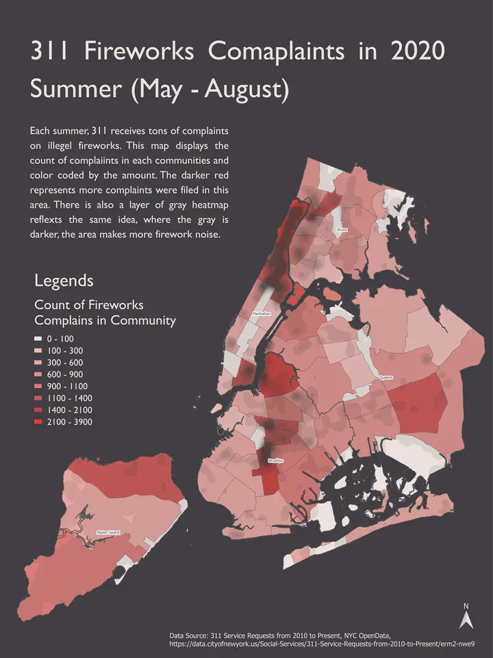
The final result of this project is a combination of a choropleth map and a heat map. The base map is NYC’s communities districts map. I’ve calculated the amount of illegal fireworks complaints in each community throughout the 2020’s summer.

The shades of red indicate the amount of total complaints in each district, with darker colors indicating more complaints. Similarly, the heatmap shows the number of complaints, with darker colors indicating more complaints. The background of the map is quite dark, and I wanted to increase the contrast between the background and the map to highlight the severity of the illegal fireworks problem and thus enhance the audience’s impression. I also wanted the dark background to remind viewers of the sky at night and the bright red color to mimic the feeling of fireworks. Instead of using a typical eye-catching color for the heatmap, I chose to use grayscale to indicate the extent. By overlaying the gray heatmap on top of the choropleth map, I wanted to represent the visual effect of smoke after the fireworks are launched. I intended to render the hazards of illegal fireworks through this design.
In addition, I added explanatory text and legends to the final map to help the audience interpret my design. I wanted to be able to guide the viewer through the areas where illegal fireworks were concentrated. The polygon colors and heatmap helped me achieve my goal.


Finally, I also created two graphs via R Studio to demonstrate the change in the number of fireworks complaints over the time.
First, I categorized each complaint into three time periods of the day (morning: 8:00 – 16:00, afternoon: 16:00 – 0:00, evening: 0:00 – 8:00) and calculated the statistics separately, presenting them in a pie chart. I found that the number of complaints at night constitutes the majority of the data. Next, I grouped the complaints by week and used a histogram to show the number of complaints for each week. We can see that the number of illegal fireworks complaints increased sharply from week 24 (the first week of June) and continued throughout June until mid-July, when it dropped back to the level before week 24.
I didn’t include these two data analysis graphs in the final product. After some simple user experience experiments, I decided that showing both temporal and spatial distributions would make the finished product too crowded and logically complex, which might discourage audiences from reading. Therefore, I settled on solely showing the overall geographic distribution of illegal fireworks complaints.
Reflection
The following points limit this project.
First, through the pie chart, I found that the percentage of complaints at night is extremely high, which is reasonable because fireworks at night affect people’s rest the most. However, it also reflects that there is a bias in estimating the number of illegal fireworks by the number of complaints.
Second, in the results, my choropleth map and heatmap represent the same set of data. If the heatmap is replaced with other data, such as income by region or recent crime rate, it could show more comprehensive information.
References
- “311 Service Requests from 2010 to Present | NYC Open Data.” Accessed April 24, 2022. https://data.cityofnewyork.us/Social-Services/311-Service-Requests-from-2010-to-Present/erm2-nwe9.
- NYC Open Data. “Community Districts.” Accessed April 24, 2022. https://data.cityofnewyork.us/City-Government/Community-Districts/yfnk-k7r4.
- “Nybb | NYC Open Data.” Accessed April 24, 2022. https://data.cityofnewyork.us/dataset/nybb/7t3b-ywvw.
- Pereira, Sydney, Clarisa Diaz, Jen Chung, Jacob Dobkin, and Beth Fertig. “Map Shows Where NYC Fireworks Complaints Are Exploding This Summer.” Gothamist, June 23, 2020. https://gothamist.com.