Living Affordably
Analysis of Nyc Affordable Housing Plan (2014 – 2022)
Introduction
Living in New York City is not easy for many people. In addition to the high cost of daily necessities, housing expenses account for an absolute majority of New Yorkers’ incomes. According to an article from the New York Post, since 2021, New York has surpassed San Francisco as the most expensive city to live in the U.S. The average rental price for a one-bedroom apartment in New York City in 2022 is $3,532, 41 percent higher than it was in 2021, according to a report from zumper.com, a leading real estate rental platform. According to U.S. Census Bureau estimates, the Empire State is expected to lose about 320,000 population in 2021, and New York City’s population growth has fallen behind most other major cities in recent years.
Historically, New York City government has struggled to deal with excessive rental prices. Since the 1970s, what is known as the affordable housing campaign has been proposed. The latest affordable housing plan was announced in 2014 with the goal of providing below-market rents to those in need to ease their burden of living and keep people out of homelessness. The 10-year plan covers all five boroughs with a $41 billion investment in construction and other aspects. By 2022, after eight years of the program, I would like to use both mapping and data analysis techniques to examine whether the plan is having a positive impact on people’s lives, and to show my findings in a visual way.
Software
The project’s goal was to use GIS and data analysis techniques to investigate the effectiveness of the 2014 Affordable Housing Program. I employed QGIS and R Studio to help me accomplish the objective and used Adobe Illustrator for the final visual adjustments and layout design.
QGIS
QGIS is a free and open-source GIS analysis software. The rich functions and vibrant community contributions make it very easy to use. Users need only a basic knowledge of geographic information to use it for GIS analysis and to design attractive visualizations.
R Studio
R Studio is an integrated development environment based on the R language. Users can use R Studio to manage data files and perform statistical analysis more efficiently. At the same time, the vibrant user community of R has created a number of useful packages that allow R to be used to produce effective visual charts as well.
Adobe Illustrator
Adobe Illustrator is a graphic design software created by Adobe Systems. Its powerful features help designers express the ideas in their minds on screen. In this project, Adobe Illustrator is used to organizing the graphic outputs of other software and produce the final visualization.
Process
Data Sources
The datasets used in this project are collected from the Open NYC and U.S. Census Bureau. I used NYC’s 2020 census tract data to create the choropleth base map. The final datasets I used in this project include gross rent as a percentage of household income, percentage of poverty, new york housing units by building, Law 44 rent affordability, and law 44 unit income rent.
Prepare the Datasets
To begin data collection, I searched the New York City Department of Housing Preservation and Development (HPD) website and found information on participating projects and buildings in the Affordable Housing Plan on Open NYC. The affordable housing datasets are stored in three separate files, each with information on a different aspect of the project. These datasets are very comprehensive, including factors such as exact building locations, project start and end dates, the number of units of each type, and the affordability category of each unit. While it took a lot of effort to clean up the data, the richness of the dataset gave me a lot of freedom in the data analysis process.
To collect data on poverty and rental burdens data in New York City, I followed the instructions from the American Community Survey 5-year data on census.gov. I then used python to access the Census API and collect what I needed.
The data cleaning process took most of my time to prepare the analysis. Then, I used a combination of QGIS and R Studio to merge the different datasets. At last, the datasets can accurately display the poverty percentage, rental burden percentage, and unit affordability on the NYC census tract map.
GIS and Data Analysis Process
The strategy of my analysis is first to display the dataset on the maps and then compare the maps to find interesting places to further investigate.
Poverty Percentage Distribution
With the help of QGIS, I was able to project data on the percentage of poverty obtained from the Census 2020 onto a map. This map presents the percentage of individuals and families within each tract whose annual household income is below the poverty line. I used a mono-color tone to indicate the level of poverty in each tract. The darker red indicates a higher poverty rate in that tract, while the lighter red indicates a lower poverty rate.

Poverty Rate Map, NYC, 2020
From this map, we can find that the poverty population in New York City is relatively concentrated in some areas. For example, Chitown, Harlem, South Bronx, and some areas of Brooklyn. In contrast to other relatively wealthy areas, such as the Upper East Side and Tribeca. To better illustrate the poverty rate in New York City, I also created a histogram to reflect the distribution of the poverty rate.

Poverty Rate Distribution, NYC, 2020
In this histogram, we can see a clear right skew in the distribution of poverty rates across tracts in New York City. Most of the tracts have less than 50% of the population in poverty. While there are relatively few tracts with extreme poverty rate, on the other hand, it is notable that the distribution of households with annual incomes below the poverty line is very broad.
Rental Burdens Distribution
This map can be easily obtained by using the same process as the previous poverty rate map. I also used monotone to indicate the percentage of rental difficulties in each tract by different shades. In this map, the darker blue indicates a higher percentage of residents’ rent is over 35% of their income, while the lighter blue indicates the opposite.

Percentage of Rental Burden, NYC, 2020
Most tracts have residents with varying degrees of rental burden. Combined with the histogram, we can see more clearly that the majority of tracts have around 50% of residents paying at least 35% of their monthly income on rent. This map not only confirms that New York City rent prices are generally high, but it is also worth noting that there is a significant degree of overlap between the darker colored areas in both maps. It implies that for tracts with higher poverty rates, more households bear the high rental burden.

Percentage of Rental burden, NYC, 2020
Affordable Housing Distribution
The mapping process is similar to the previous maps, I kept the mono-color style to display the affordable housing units count in each tract. The darker shade of green indicates more affordable housing units in the tract and the lighter shade indicates the opposite.

Affordable Housing Units Count, NYC, 2014 – 2022, click link to view in original size
After comparing the first two maps and noticing the overlap between the poverty rate and rental burden, I also focused on the same areas in this map (the tracts marked with light blue borders, where both the poverty rate and rental burden rate are over 30%). Through careful observation, I found that although the distributions of poverty rate, rental burden rate, and affordable housing generally overlapped, the values of the other two factors were mostly lower in tracts with more affordable housing units than in the surrounding tracts. This finding inspired me to further explore whether the effect of the affordable housing plan between 2014 and 2022 could be verified by comparing the poverty and rental affordability rates of tracts with more affordable housing units with those of neighboring tracts.
Hypothesis Test
Through the observation of the three maps, I proposed the following hypothesis:
- H0: There is no relationship between the number of Affordable Housing Units and Poverty Rate Or Rental Burden Percentage.
- Ha: There is a relationship between the number of Affordable Housing Units and Poverty Rate Or Rental Burden Percentage.
Regarding how to test my hypothesis, I tried many methods, but none of them were very effective. First, I tried to extract the overlapping tracts of the three maps and their surrounding tracts for data analysis. However, since tracts are polygons and there are often multiple tracts of interest adjacent to each other, it is difficult to have a standardized criterion for determining the surrounding tracts. Finally, I chose to categorize all the tracts into those with Affordable Housing Units and those without Affordable Housing Units and compared the Poverty Rate and Rental Burden Percentage for each of the two categories, respectively. I chose to use Point Biserial correlation to validate the results because it is well suited to handle correlation analysis between a dataset with a categorical variable and a quantitative variable. Below are the test results:
Correlation Test Result Between Affordable Housing Unit Existence and Poverty Rate:
                         Pearson's product-moment correlation
data:  AffordableHousingImpact$CountUnits and AffordableHousingImpact$PovertyRate
t = 14.143, df = 2224, p-value < 2.2e-16
alternative hypothesis: true correlation is not equal to 0
95 percent confidence interval:
 -0.3249316 -0.2486857
sample estimates:
       cor
-0.2872637
Correlation Test Result Between Affordable Housing Unit Existence and Rental Burden Rate:
	                 Pearson's product-moment correlation
data:  AffordableHousingImpact$CountUnits and AffordableHousingImpact$RentalBurden
t = 0.90704, df = 2217, p-value = 0.3645
alternative hypothesis: true correlation is not equal to 0
95 percent confidence interval:
 -0.06082289  0.02236910
sample estimates:
        cor
-0.01926023
The p-value for the Poverty Rate correlation test is significantly less than 0.05, which provides strong evidence to reject the null hypothesis that there is no relationship between Affordable Housing Unit number and Poverty Rate, and the correlation is negative. However, the p-value between the Affordable Housing Unit number and the Rental Burden Rate is larger than 0.05, and the confidence interval contains zero. Thus, we cannot reject the null hypothesis.
In conclusion, the test results reflect that tracts that have affordable housing units have a lower poverty rate than the tracts doesn’t have those, with more affordable housing units built in a tract, the poverty rate is lower. However, rental burden rate and affordable housing unit number don’t necessarily have a relationship.
Residents Complaints Analysis
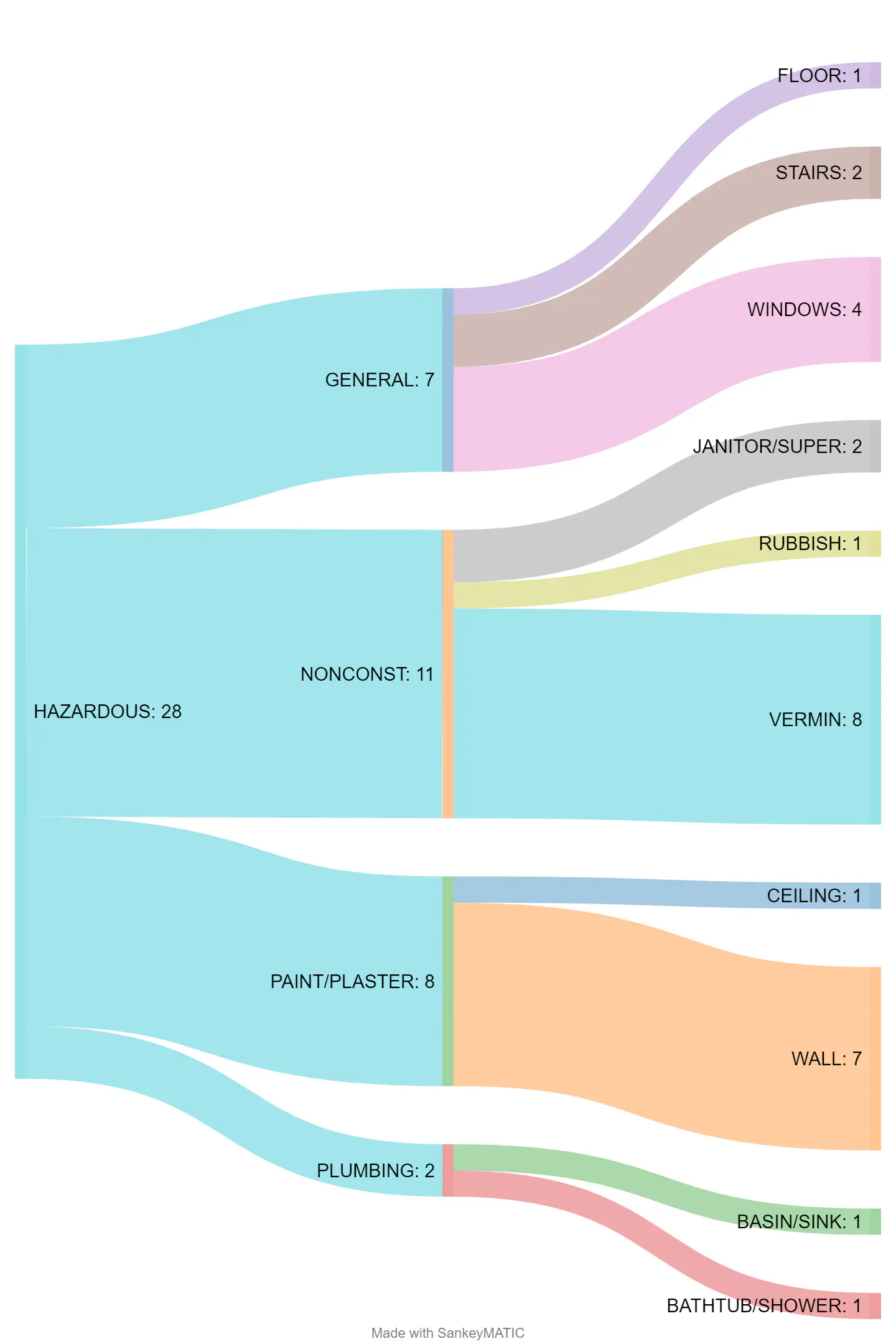
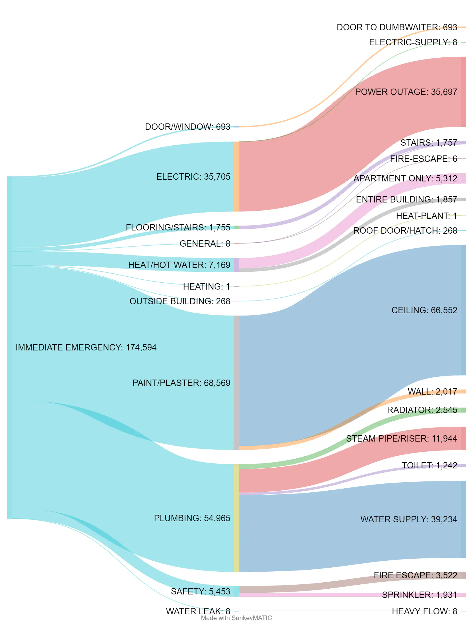
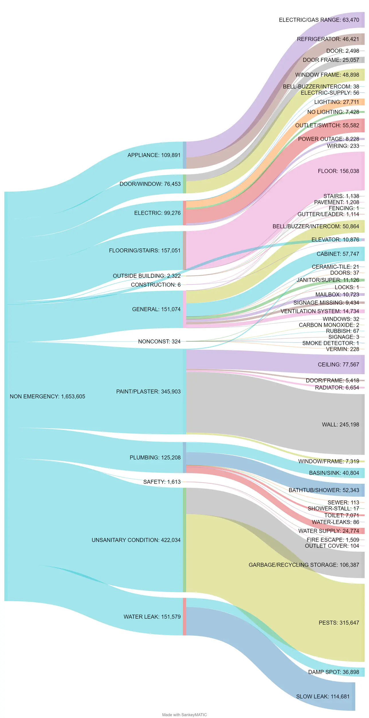
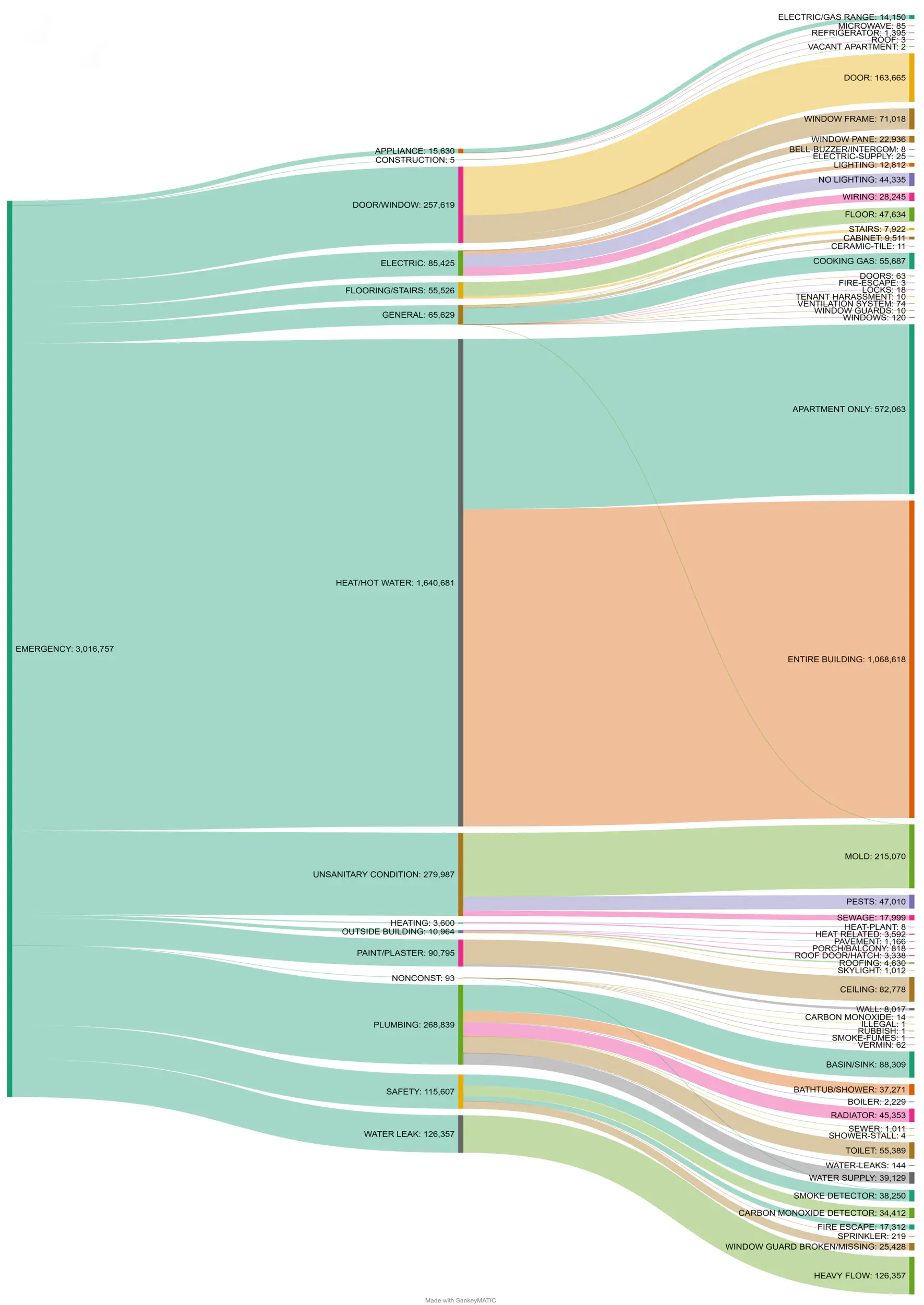
At last, I created a series of treemaps to visualize the composition of affordable housing residents’ complaints from 2014 to 2021. I would like to identify what problem concerns the most to these residents in order to have a general idea of the affordable housing construction quality. I categorized the complaints by three levels:
- Emergency Level
- Major Category
- Minor Category
The original size plots can be found with this link.
\
From this series of diagrams, we can see that complaints about Heat and Unsanitary Conditions are overwhelmingly common, which aroused my curiosity. I wanted to get a deeper understanding of the causes of these problems, but unfortunately, the complaint dataset I found did not indicate which building the problem occurred in, so I could only speculate on the causes to the best of my ability.
I first calculated the ratio of affordable housing construction types as of 2021, where the number of new construction units is 2354, which is lower than the 3277 preservation construction units, a ratio of about 1:1.4. However, I could not find the initial completion date of preservation buildings, but preservation buildings make up the majority of the affordable housing plan and the complaints data is calculated from 2014, when most new buildings were not yet built, thus I assume this is the reason for complaints are mostly focused on Heat and Unsanitary Condition.
Taking a step further, I used R Studio to make a very rough line graph comparing the number of newly constructed buildings and complaints each year to show an assumption. The red line shows the newly constructed building, and the black line shows a tenth of the number of complaints. Although the trend is similar in general, it is worth noting that in 2019 the number of complaints declined instead while the number of new buildings increased. Perhaps this could be a potential breakthrough to explore affordable housing’s construction quality.

However, the actual situation is way too complex and my current datasets are not enough to support further investigation. I will further explore this topic in the future when I have a chance.
Finding
In conclusion, through this series of GIS and data analysis, I was able to show that rent prices in New York City are generally too high, and in combination with the distribution of poverty rates in New York City, I was able to confirm that the need for Affordable Housing Plan is genuine. Furthermore, through statistical analysis, I was able to demonstrate that the Affordable Housing Plan has had a positive impact on the lives of people in desperate need of housing.
User Experience Research
After completing the data analysis, I moved on to design my final visualization. I contacted two of my friends who also live in New York City and come from different professional backgrounds (one from the music industry and one from the illustration design industry). They didn’t know much about data analysis and visualization, and they were both new to New York City so they also didn’t know much about my project topic. Since my expected audience is the general public, I thought they were the ideal participants for my UX research.
I chose to use video conversations for my UX research since I wanted to be able to observe their facial expressions. I conducted a 30-minute interview with each of them, and each interview was divided into 3 parts of 10 minutes. First I gave them a brief introduction to the context of the Affordable Housing Campaign in New York City and the process of my UX research as well as the concept of think-alouds, then I invited them to view the graphs I created during the analysis. I remained silent during this session and observed their reactions while noting down their questions. Next, I answered their questions in detail and presented my process and analysis strategy. Finally, I invited them to give me some suggestions for my final design and discussed together how to present my finding.
Both participants had difficulty viewing my working plots during the first session. One of the participants from the music profession was so quiet most of the time that I had to ask him where he was paying attention to. Participants from illustration backgrounds felt that the contrast between the background color and the highlighted colors of the maps was not strong enough to best emphasize what I wanted to show. They both agreed that the histogram did not help them understand the severity of the poverty rate and rental burden in New York City at all. Also, they felt that the p-value and correlation coefficient did not support them in reaching the same conclusions as I did. In addition, the complaints treemap did not link them to the information presented on the map. On the other hand, the participants noted that by reading each map individually, they were able to notice that the distribution of poverty rate and affordable housing units were more concentrated in some areas.
In the second session, two participants expressed confusion about the process and conclusions of my analysis, as they both found it very difficult to understand the poverty and rental burden situation through percentages. In contrast, the use of concrete numbers for affordable housing units was much easier to follow. They both agreed that the complaints’ treemaps, even though they were a good visual representation of what kinds of problems affordable housing residents encountered the most, were difficult to relate to my topic. Finally, both participants thought they could understand the significance of the statistical results after I explained them, but it took a lot of time to introduce and explain.
We ended with a discussion about the problems and confusion that each of the two participants encountered, and I summarized their ideas and suggestions into the following bullet points that I need to keep in mind for my final production:
- For viewers who are not aware of the Affordable Housing Campaign, it is impossible to link the maps I created together.
- Legends and titles should be more specific about the content in the graph.
- It is very difficult to understand the distribution of percentages using a histogram, a more simple and intuitive graph should be used instead.
- The color palette should increase the contrast to highlight the subject I want to show.
- Descriptive text should be added to help viewers understand the topic.
- Numbers can be used more often to convey information in a simple and intuitive way.
- The final finding can reduce the statistical interpretation, and it would be better to show the conclusion straightforwardly.
Final Output
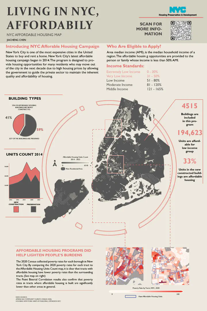
After carefully reviewing the results of User Experiment Research, I finally decided to create an informative poster to present my findings more concisely and directly to the general audience.

Design
I started by adding descriptive text to introduce the background of the Affordable Housing Campaign to the audience and to direct their attention to the map in the center. I chose to use the Affordable Housing Units map as the main body because it most directly reflects the subject of my investigation. On the sides of the main map, I chose to use pie charts, area plots, and numbers to visually display some stats about the Affordable Housing Plan, which I hope will help readers understand the details of its implementation and planning. I also tried to shift the audience’s attention to the bottom of the poster by using visual guidelines, where I overlayed the NYC 2020 Poverty Rate map and Affordable Housing Units map that show selected details of the main map to present my analysis result.
The color palette of this poster is very restrained, using only black, white, and red to increase contrast and prioritize the elements in the image. I reduced the saturation of the colors to make the overall picture more harmonious. I also used shapes and lines to differentiate the sections and show different content in each of them. Finally, I used visual guidelines to link the sections together to form the story.
Conclusion and Consederation
There are several things that could be done better in future studies. First, the data sets used for comparison are not up-to-date. It is an expedient measure to compare the 2020 poverty rate and rental affordability percentages with the distribution of total affordable housing units. Ideally, a dynamic map showing these three factors by year would be more intuitive to read and would produce more accurate data analysis. Second, the complaint analysis in this project is fairly basic, and there are more aspects to explore in depth in possible future projects. Finally, the study of Affordable Housing Program‘s impact only considered the poverty rate and rent burden ratio. More aspects such as surrounding educational resources, security, and amenities deserve deeper discussion.
Resources
- Archive, View Author, and Get author RSS feed. “NYC Rents Now Most Expensive in the US: Report.” New York Post (blog), August 24, 2021. https://nypost.com/2021/08/24/nyc-rents-now-most-expensive-in-the-us-report/.
- Zumper – Apartments for Rent & Houses. “Average Rent in New York, NY and Cost Information – Zumper.” Accessed May 1, 2022. https://www.zumper.com/rent-research/new-york-ny.
- Bureau, US Census. “For Renters, Housing Cost Burden Is About the Same.” Census.gov. Accessed May 1, 2022. https://www.census.gov/library/stories/2019/11/decade-after-the-recession-housing-costs-ease-for-homeowner.html.
- “Cost of Living in New York.” Accessed May 10, 2022. https://www.numbeo.com/cost-of-living/in/New-York.
- The official website of the City of New York. “Mayor de Blasio Unveils ‘Housing New York’: Five-Borough, 10-Year Housing Plan,” May 3, 2014. http://www1.nyc.gov/office-of-the-mayor/news/199-14/mayor-de-blasio-housing-new-york–five-borough-10-year-housing-plan-protect-and.
- “New York Saw Greatest Population Loss in U.S. This Year, Census Bureau Estimates.” Accessed May 3, 2022. https://news.yahoo.com/york-saw-greatest-population-loss-164356557.html.
